
UX Research for a Two-Product B2B
Led mixed-methods UX research for strategy.com's /software section, covering the homepage and two flagship B2B products, Strategy Mosaic and Strategy One. The brief: figure out why the two product pages converted so differently, and whether unclear positioning was costing the business qualified prospects.
Tools: GA4 (behavior, path exploration, conversion events), Microsoft Clarity (heatmaps, scroll/attention maps, session recordings), UserTesting.com (moderated remote testing).
link to website: click
Team
Patrycja
Web Manager
My role
UX Research
Usability Testing
Project Timeline
90-day behavioral analysis
of the software homepage and
product pages
[The Problem]
Stakeholders assumed the site had a cross-product confusion problem - that visitors were getting lost between Mosaic and Strategy One and leaving without understanding which product fit their needs. Strategy One's pricing page converted roughly 6x better than Mosaic's, and the working theory was that unclear navigation was blending the two products together in visitors' minds.
[Research question]
The research question: is this actually a confusion problem between two products, or something else entirely — and what, specifically, should change on the site to close the conversion gap?
[Personas]
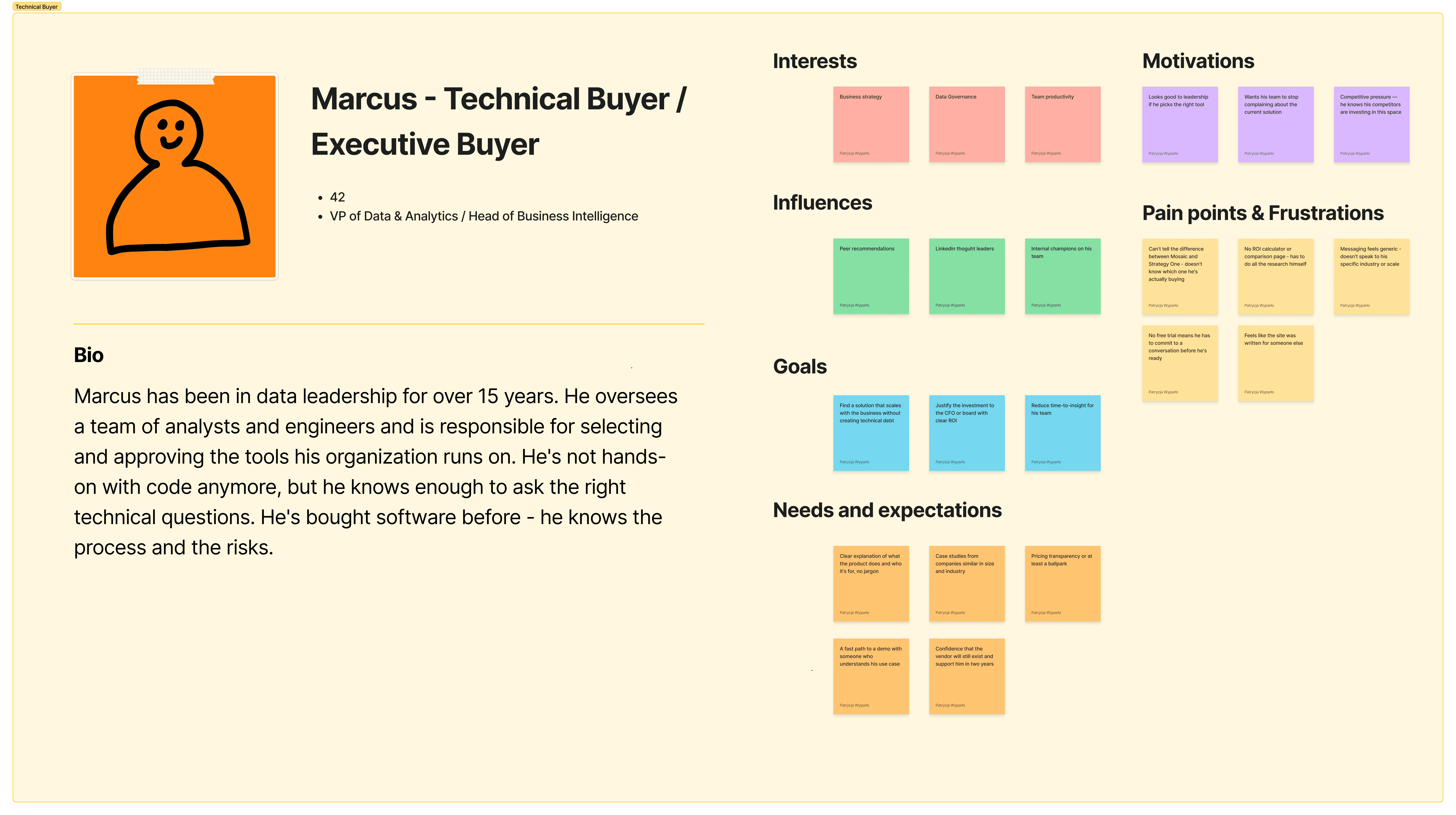
Two personas anchor the recommendations and the usability test design, both drawn from a working persona board.

[Process]
Quantitative behavioral analysis (GA4). Session duration, bounce/engagement rate, path exploration, segment overlap between Mosaic and Strategy One visitors, and conversion events, split by new vs. established users.
Attention analytics. Scroll-depth distribution, section-level heatmaps, and click maps on the homepage to see what visitors actually saw and clicked.
Qualitative session review. Watched 12 individual Microsoft Clarity recordings across both product pages, plus dead-click analysis, to observe hesitation, confusion, and drop-off moments directly.
Synthesis. Triangulated all four sources into root causes and a prioritized set of recommendations (quick wins, structural fixes, strategic direction), delivered to the web director and product stakeholders.
Usability testing. Designed a moderated test with two personas: a hands-on Technical Experimenter and a budget-holding Technical Buyer to validate the analytics findings directly with users, including screener criteria and task scenarios.


[Key Findings]
The data overturned the original hypothesis: strategy.com doesn't have a confusion problem, it has a clarity and next-step problem. Only 8% of visitors ever see both products, so there's very little cross-product "jumping." Each page runs its own largely isolated funnel, and one of them has almost no mechanism to convert the attention it earns.
Decision window
New visitors spend ~90 seconds on the homepage before clicking deeper or leaving; 43% leave without clicking anything.
Attention distribution
70% of visitors never scroll past 15% of the homepage; below-the-fold content is effectively invisible.
Cross-product overlap
Only 8% of visitors see both products —> isolation, not confusion.
Mosaic Conversion
Main page: 18,000+ views, 0.02% conversion; its best-converting page (an ROI calculator) sits outside main navigation.
Strategy One Conversion
Converts to pricing 6x better than Mosaic, largely due to a persistent CTA banner Mosaic lacks entirely.
Trust Damage
A live 404 error was hit during a recorded new-user session on a core product link.
[Validating with Usability Testing]
To pressure-test the findings and recommendations before committing engineering time, a moderated usability study was run with 8 participants. 4 Technical Buyers and 4 Technical Experimenters. Each persona worked through a realistic scenario.
Across both personas, usability testing validated the core analytics findings:
Participants took roughly a minute to explain what the company sold, echoing the ~90-second decision window seen in GA4, several opened the FAQ unprompted looking for clarity, mirroring the session-recording pattern.
No participant treated Mosaic and Strategy One as confusing alternatives; each read whichever page they landed on in isolation, consistent with the 8% cross-product overlap in the data.
All 4 Technical Experimenters tried to find hands-on access or a sandbox before considering next steps, confirming the trial/demo gap on Mosaic.
3 of 4 Technical Buyers didn't locate the ROI/cost-control content without prompting, reinforcing the findability issue with hidden high-performing pages.
Participants who hit the broken link or the missing Mosaic CTA reacted with visible hesitation and lowered trust, matching the friction points flagged in the session recordings.


[Recommendations]
Delivered as a prioritized roadmap rather than a single list, so engineering and design could sequence the work.
Now (quick wins)
Fix the broken product link; correct logo behavior; remove non-interactive elements styled as links; promote the Product Tour CTA; separate investor-relations logins from product conversion tracking.
Next (structural)
Give Mosaic's main page a persistent next-step CTA; add top-performing hidden sub-pages to main navigation; move the product distinction above the 15% scroll line; surface a lightweight FAQ higher on the page.
Later (strategic)
Decide deliberately whether Mosaic stays an awareness page or becomes a conversion page; build an interactive product tour for Mosaic; instrument the untracked user segment separately.
[Reflection]
The most important move in this project was refusing to accept the stakeholder's framing at face value.
he initial ask was to fix a "confusion" problem; the data showed the real issue was clarity and conversion mechanics within isolated funnels, a very different (and more actionable) diagnosis. That reframing changed what got prioritized on the roadmap.
This case demonstrates mixed-methods rigor: triangulating quantitative behavioral data with qualitative session review and the ability to turn raw analytics into a prioritized, engineering-ready roadmap that stakeholders could act on immediately.
NEXT PROJECT

Zetflix

Charity Gala Website